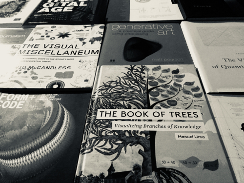
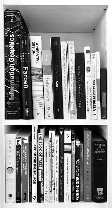
Introducing data visualization can be a complex topic. “Look over the edge of the plate” – thinking around design, analytics, and programming, combined with an open minded understanding, is necessary to generate visual insights from transforming data into form. Gaining knowledge in this proficiency by acquiring books around this domain depends on your own background and your interests. A couple of books are filling my bookshelf and influenced my work to create data visualizations. This bookcase is far away from being complete but gives an outlook on related disciplines.
The bookcase can be divided into five categories:
Human Perception: A sense-making arrangement of visual properties in data design was established by pre-attentive attributes of the Gestalt school, which evolved the visual brain to detect patterns through instant sorting of differences and similarities.
Design: Encoding data into visual representations is a combination of form, color, spatial position, and motion with the underlying data attributes. This intersection is the core of constructing data visualizations that affects the discovery of insights, decision making, telling of data-driven stories, or finding responses to hypothetical questions.
Technology: Implementing insightful and interactive visualizations is depending on the chosen technology. Browser-based visualizations with frameworks like D3.js provide the possibility to reach a broad audience or on the other hand to achieve an immersive experience with the technology-mix of virtual reality and 3D programming languages like Unity. Both technologies determine the available visual space and possible users.
Analytics: Applying visual principles to the underlying data set requires competencies around descriptive/multivariate statistics, geometry, and data modeling. This allows the mapping of visual properties (shape, color, position, animation) onto transformed data that includes the raw material for representing insights.
Art: Challenging the boundaries of data visualization can be an inspirational source to find new ways of visual representations. The interplay between art and design can deliver synergies to shape a compelling visual story with experimenting aesthetics, interaction, and their interpretation.
A historical retrospect of data visualization links directly to the Gestalt school with introduced principles like proximity, similarity, symmetry, or repetition. There are two interesting aspects about the term Gestalt. The first aspect was summarized by Alberto Cairo:
“In fact, the word gestalt means pattern.” – Alberto Cairo
The second aspect is that those principles work for a low amount of data as well as for a high amount of data. Summarizing these two aspects reflect the capable number of visual encodings resulting in their possible number of patterns. The past years have shown that the number of visual encodings is extremely large.
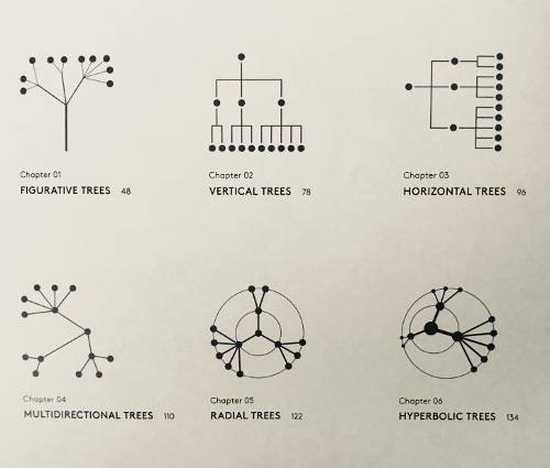
This is the root cause of classifying the large number of visual encoding into categories based on the identification of similarities in visual structures. Authors like Manuel Lima, David McCandless, the team around generative design (Hartmut Bohnaker, Benedikt Groß, Julia Laub, Claudius Lazzeroni), and Bruce Wands already collected visual works to catch up overall topics, Those collections are representing the work of curators. The categorization of visualization into more detailed topics like networks, generative art, or digital art allowed precise definitions and their considered challenges. Even more brought the works by Manuel Lima generalizable types of visualizations (taxonomies) as one example. Trees can be categorized into figurative, vertical, horizontal, multidirectional, radial, or hyperbolic structures.
This excerpt of works from curators deliver sustainable insights around data visualization but what are the next steps for curators that are facing the upcoming trends of emergent technologies (virtual/augmented reality) and the increasing amount of data (Big Data)? The capability to effectively display a large amount of data remains one of the top challenges of visualization tools in the past decades. Scalability is not only important for big data engines but also for visualization itself. Seeking a higher visual scalability is the consequence of the bottleneck between the fast growing amount of data and the capability to recognize unknown patterns visually.
Beginning with human perception that is essential to explore highly scalable visualizations based on the visual scene, pattern perception, and visual working memory. The combination with projection technologies like flat displays or virtual environments provide an unlimited spatial environment for information visualization. This is the basis to display the variety of visual metaphors that ranges from bar charts, scatterplots, heat maps, parallel coordinates, spatial coordinates, tree maps, graphs, and the development of new visualization techniques is still ongoing. Enriching those visual metaphors with interactivity connects the human capabilities with the visual analytical system. This connection allows the discovery of meaningful patterns through interactive methods. As a result, the range of human capabilities will be increased through a wide range of interaction methods, and the user will be able to construct an individual search strategy.
These possibilities are the result of more and more available data that are going beyond the data tables from the relational database model. This includes image, video, or audio data. But this will also raise up higher hardware requirements for delivering highly scalable visualization techniques with a high-performance infrastructure. The insufficient computational infrastructure can lead to a low visual scalability, including only a low number of visual elements on the left-hand side or too slow performance to visualize a large data set on the right-hand side.
In short, visualizations are becoming larger and their construction of shaping big data sets, too. Putting all these challenges into the topic of scaling data visulizations with the goal to present that kind of visual works will be the main purpose of this blog.
The list of Books
Information Graphics – Sanra Rendgen, Ed. Julius Wiedermann
Farben – Norbert Welsch, Claus Chr. Liebmann
Generative Design – Hartmut Bohnacker, Benedikt Groß, Julia Laub, Ed. Claudius Lazzeroni
Parallel Coordinates – Alfred Inselberg
Now you see it – Stephen Few
The Visual Display of Quantitative Information – Edward R. Tufte
Visual and Statistical Thinking: Displays of Evidence for Mkaing Decisions – Edward R. Tufte
Visual Complexity – Manuel Lima
The Nature of Code – Daniel Shiffman
Information Visualization – Robert Spence
Visualize This – Nathan Yaou
Sinn und Form – Herausgegeben von der Akademie der Künste
Troisième année de Géométrie – Julien Boitel
A Beautiful Questions – Fank Wilczek
Collective Intellience – Toby Segaran
Programming 3D Applications with HTML5 and WebGL – Tony Parisi
D3.js – Mike Dewar
Multidimensionale Skalierung – Ingwer Bork, Patrick J. F. Groenen, Patrick Mair
Art of Digital Age – Bruce Wands
The Book of Trees – Manuel Lima
the functional art – Alberto Cairo
The Visual Miscellaneum – David McCandless
The Data Journalism Handbook – Ed. Jonathan Gray, Liliana Bounegru, Lucy Chambers
Universal Principles of Design – William Lidwell, Kritina Holden, Jill Butler
The Infographic History of the World – Valentina D’Efilippo & James Ball
Guide to Information Graphics – Dona M. Wong
Form+Code – Casey Reas, Chandler McWilliams, LUST
generative art – Matt Pearson
Information is Beautiful – David McCandless
Principles of Gestalt Psychology – K. Koffka
Epilogue
The listed literature does not include any sources from scientific databases. Detailed information might be interesting with the following state-of-the art analysis or further public blogs:
- Shaping Unlimited Patterns: A Vision for State-of-the-Art Visual Scalability
- Data and visualization blogs worth following